1313 a Salon
UX/UI & VISUAL DESIGN
Boulder’s best hair salon offers classic & on-trend haircuts, balayage, and color by the best stylists using sustainable products.
1313 a Salon is your one-stop for healing massage, medical grade facials, the latest in laser skin treatments, and injection enhancements.
The team at 1313 a Salon believes that beauty is directly connected to your healing. They are paving a new industry standard for premium services in the world of hair, health, and beauty.
Clients
1313 a Salon
Date
2019
Role
Lead Designer / Visual + UX Designer
DELIVERABLES
Digital Assets
UI Design
Iconography
Typography
Website
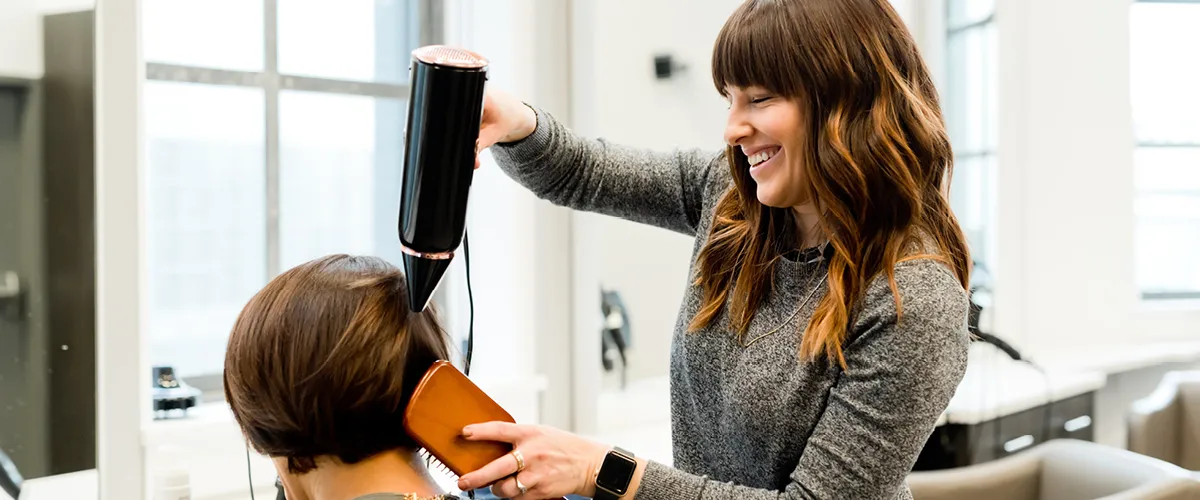
Project Vision
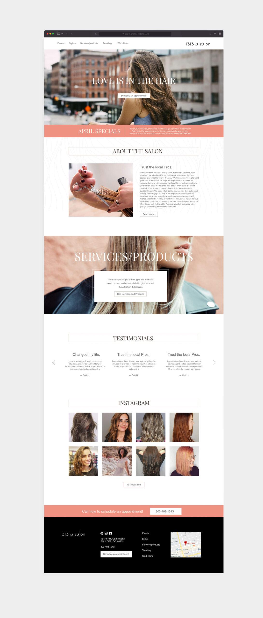
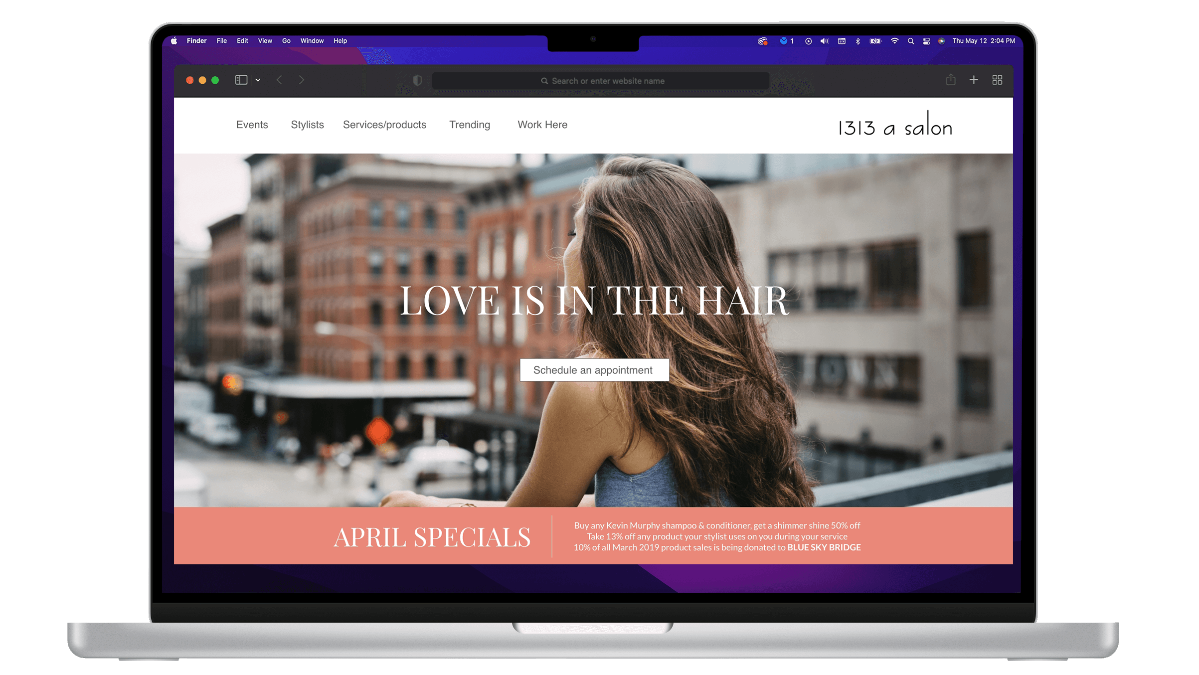
The objective was to not only give 1313 a Salon a new look and feel, but to make their website easier to engage with as a user, and to guide users to book an appointment.
The website needed to be designed to provide relevant and clear information on the unique services A 1313 Salon offers in an attractive way, to make users feel confident in booking when they schedule an appointment.
Challenges
1) Eliminate barrier to entry on application startup
2) Design a cohesive interface for familiar and unfamilar users
3) Create a minimalistic UI while keeping fluidity as the focus
4) Provide a seamless & linear booking and booking experience
Starting Point
In 1313 a Salon’s design process, we opted for a goal-directed design approach that helped us move through the timeline smoothly. Qualitative research methods proved the most effective during our design process, most notably our user interviews and usability testing sessions. In 1313 a Salon’s case, we did this by asking some generic internal questions. Mainly focus on how they prefer to book their sessions.
ASSUMPTIONS
Understanding our assumptions was important to the process because it would allow us to distill what was accurate and what wasn’t. We established a starting point where each team member could ask specific questions about our audience, issues that may arise, and how we might go about solving them.
Business Goals: How the business strives to succeed in the market
Users: Who is our audience? (Behavioral Archetypes, personas, etc.)
User Goals: What goals will the users want to accomplish when using the site?
Potential Features: How to bridge the gap between users and their goals?
User Testing
Our team interview a sample of eight participants when conducting research during our first design sprint cycle.
Organizational Tools
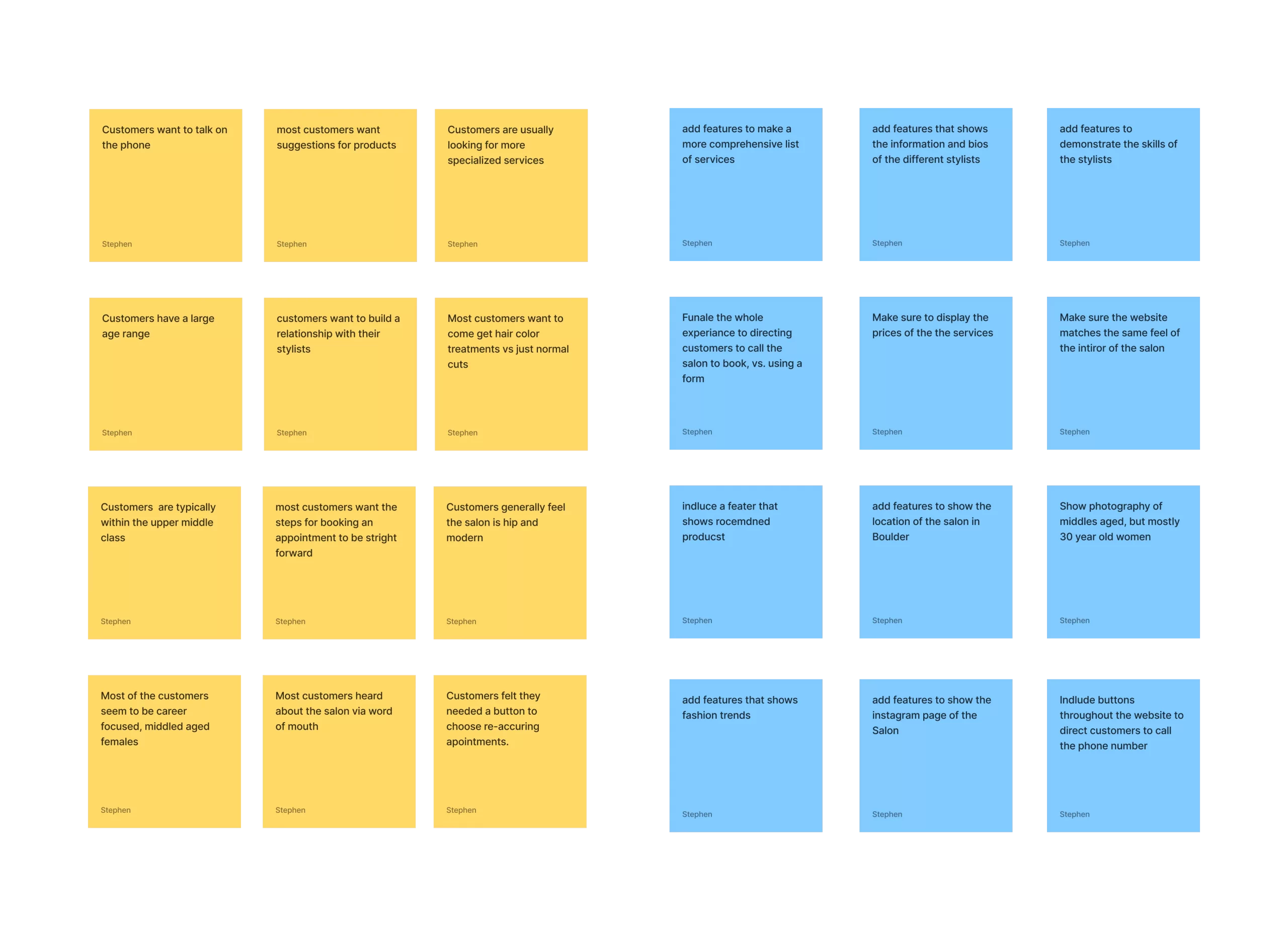
Many large salon chains offer similar products and services that 1313 provides, and 75% of the participants we interviewed agreed. However, most large chains require that you fill out an online form to book an appointment. Our users stated they prefer to schedule their appointments via phone vs. filling out online forms.
“I like to research a look for good salons, but at the end of the I want to speak to the hairdresser to make sure they understand my needs.”
A Deeper Understanding
The ways one could schedule and track appointments are vast. However, 80% of participants noted they liked speaking to their stylists and vice versa. Relationship building and human interaction is key to 1313 A Salon’s business.
“I’m familiar with my stylist, and I like that she and I have a trusting relationship. I always know she’s going to make my hair look great.”
Hypothesis Statements
After we collected our assumptions into hypothesis statements, we created a backlog of our work. Next, we prioritized them according to which had the most amount of risk and least amount of risk so that we could work on them first to either validate or pivot towards another idea.
Affinity Map
Competitive Analysis
We looked at several potential competing companies, and although many compete directly with 1313, they still infringe on the business’ revenue & popularity. 1313 a Salon has the opportunity to capitalize on this by bringing services to create a one-stop shop for their customers.
The majority of the features between competitors were very similar, however the main differences that we noticed were:
– Easily Accessible vs. Hardly Accessible
– Too Many Screens vs. Simplified Interaction
– Bright / Distracting Interface vs. Minimalistic Interface


Primary
Alice // Age: 55 // Married, Mother of 4 // Office Manager
Alice, a 55-year-old business women, who has an income of about $100,000 a year. She works Monday through Friday, 9–5, and has a passion for making sure her hair looks good. She uses Facebook on a daily basis. She spends her free time gardening. She gets her hair done frequently and cares about the hair service she receives and the products put into her hair.
SECONDARY
Miranda // Age: 25 // Family: Single // Copy Writer
Miranda, a 25-year-old women, who recently graduated college and works as a copy writer in a marketing agency. She lives just outside Los Angeles. She makes around $70,000 a year and is considered very tech savvy and quite impatient when it comes to technology. She uses social media very heavily. She does not have much time to get her hair done, unless it is for a special occasion.
Creating a Framework
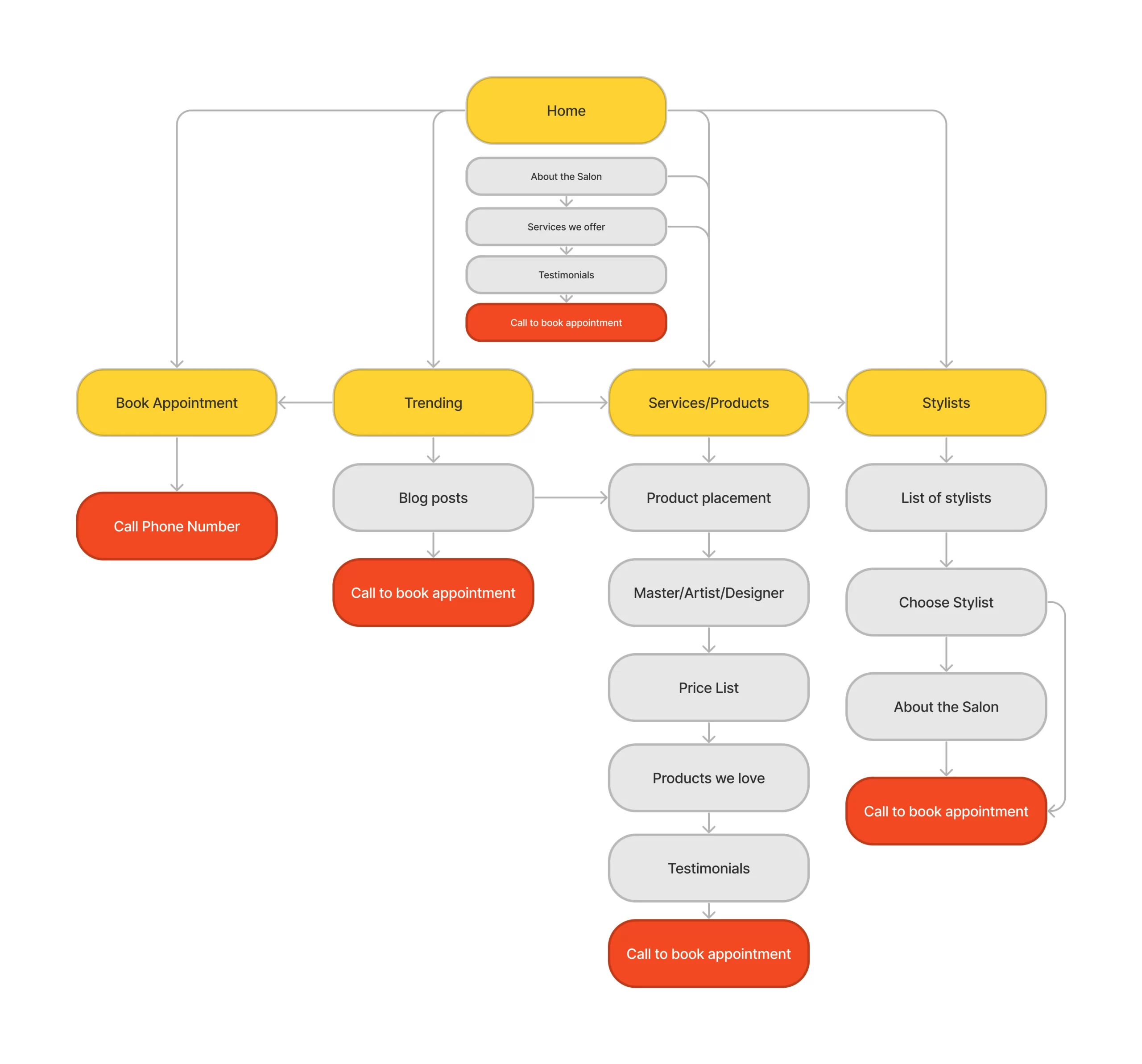
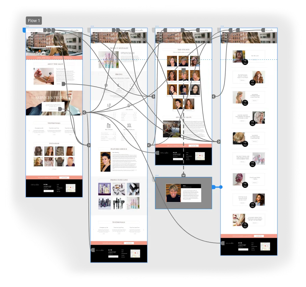
We constructed a user flow of what a basic start to finish journey looks like while purchasing an item. This helps us in understanding ways users can interact with the product, as well as allowing us to see navigation through user goals.
Paper Wireframes
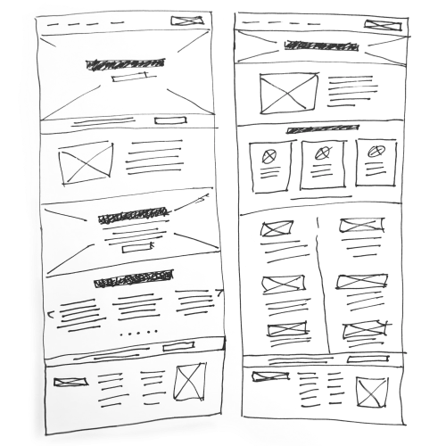
To start talking about the pros, cons, and “what-ifs” of each sketch. It was interesting to see the differences between each rough idea take shape—as this was essentially the first time we could view different interpretations and iterations of what the function app should look like.
Wireflow
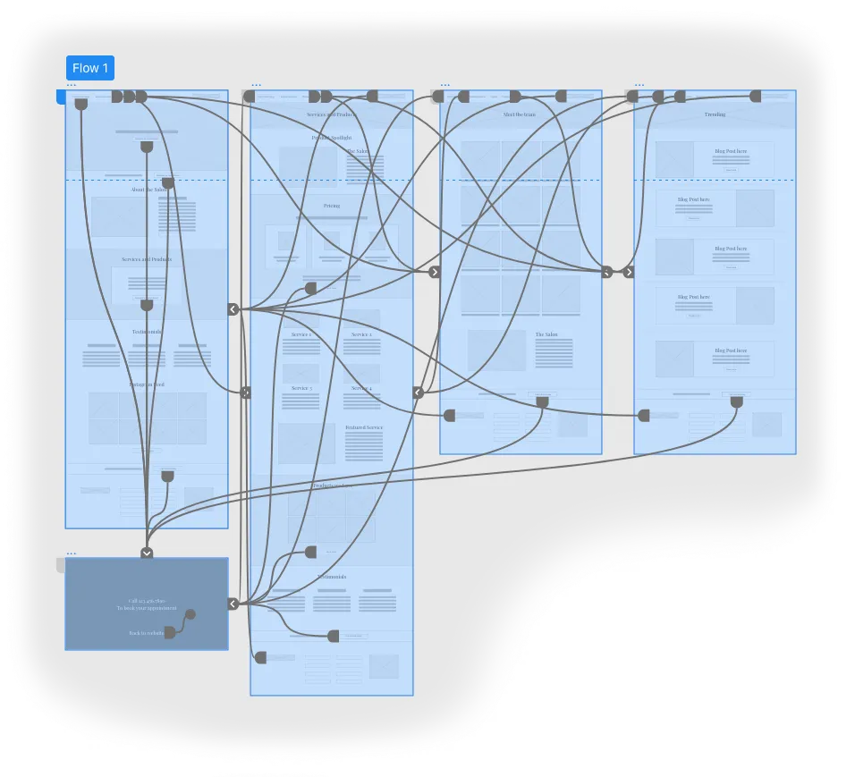
After sketching out some paper wireframes and thinking through the preliminary flow, we reviewed what was necessary, unnecessary , and what areas needed improvement. We poured a lot of our time into this step to make sure we had the finishing touches on the underlying UX before moving onto the visuals.
Challenge 1
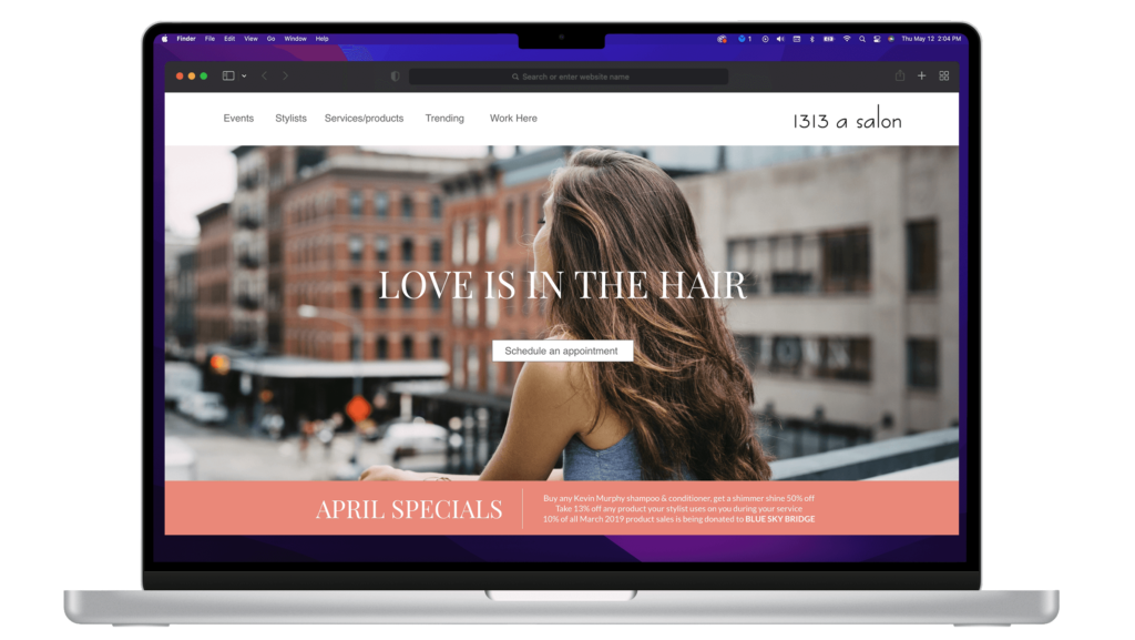
Eliminating Barriers
A key factor when trying to gain a userbase is to create a home screen void of conflict. If the user wishes to browse the pages on the site. They might be more inclined to book an appointment later on, after seeing all the key information and services the Salon offers first.
Challenge 2
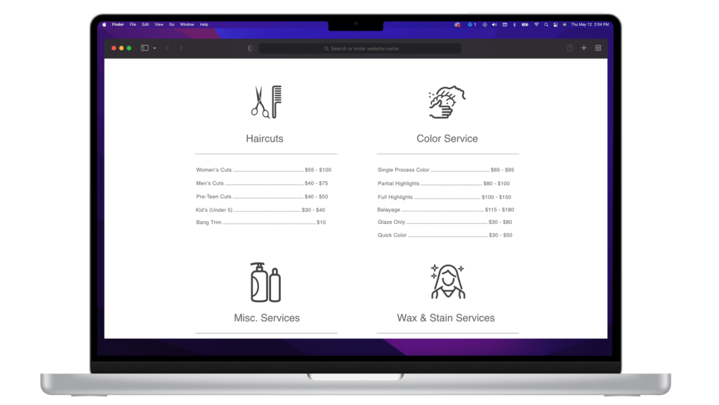
A Familiar Experience
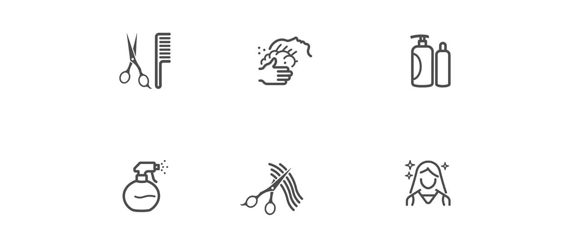
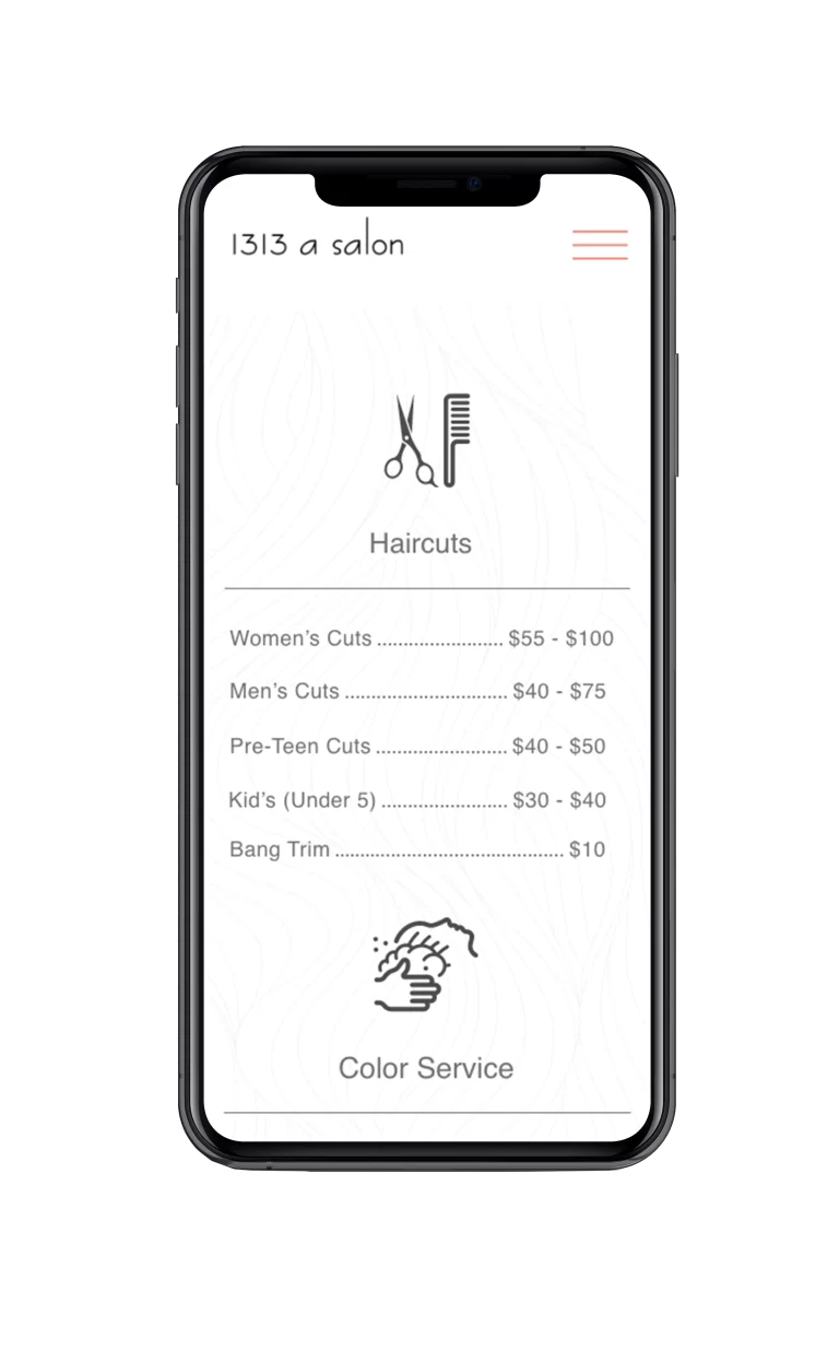
While 1313 a Salon’s primary audience is intended to be 25-55-year-old career women, those outside of that world need to be able to use the app as well. With recognizable iconography, an intuitive layout, and a simple linear booking process, we think the site achieves just that.
Challenge 3
Staying Focused
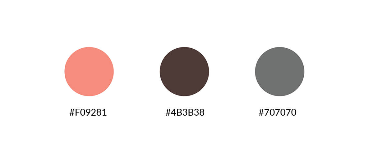
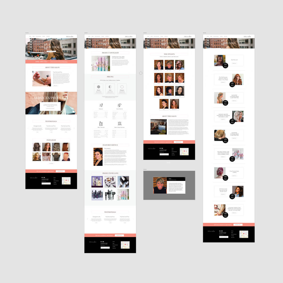
The UI consists of a neutral, two-toned white and grey color scheme except for pink and black signifiers and highlights. Using color sparingly throughout the application’s interface allows for the items to be the focal point during user engagement.
Challenge 4
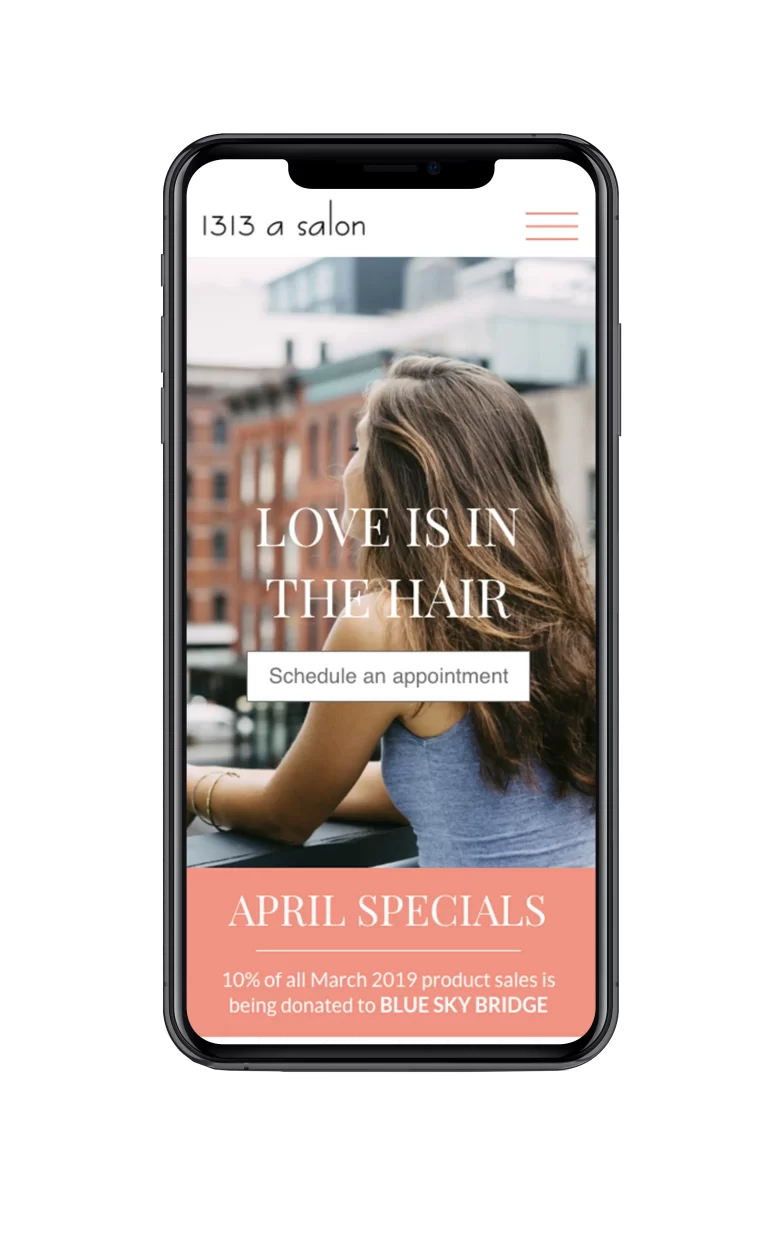
Simple, & intuitive
With a booking method being accessible with one or two taps or clicks on any page, it allows the user to easily access any service or stylist’s information within a few taps. This design allows for minimal screen usage while finding needed information.
Style Guide
Combining calming colors to create 1313 a Salon’s signature look came from wanting to express to users just how easy, and straight forward the overall booking experience can be. We wanted customers to have a premium experience not just at the salon, but on the website as well. It doesn’t have to be complex or frustrating. The home screen feels warm and welcoming enough to draw the user further in, while also displaying the most relevant information first hand.
