Gooey Cube
UX/UI & VISUAL DESIGN
Gooey Cube helps Game Masters run epic games. How? By creating engaging adventures in an expansive world with a rich history that comes alive every time it’s played. Gooey Cube helps GMs craft epic tales that are compelling for players, and entertaining for the Game Master.
Gooey Cube adventures provide intriguing plot lines, extensive subplots, complex characters, dynamic content, GM support materials, and original artwork – all to make for a deep, expansive, and highly engaging game experience.
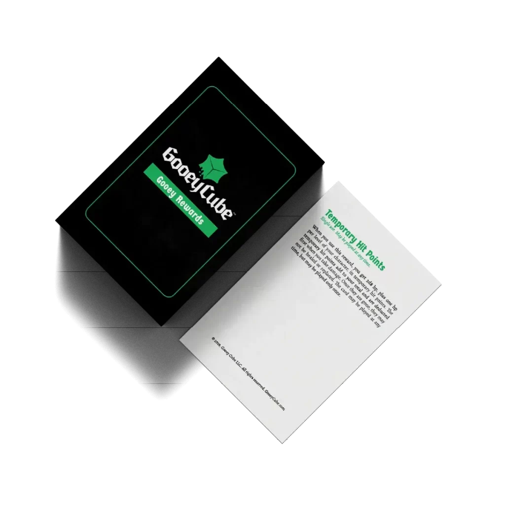
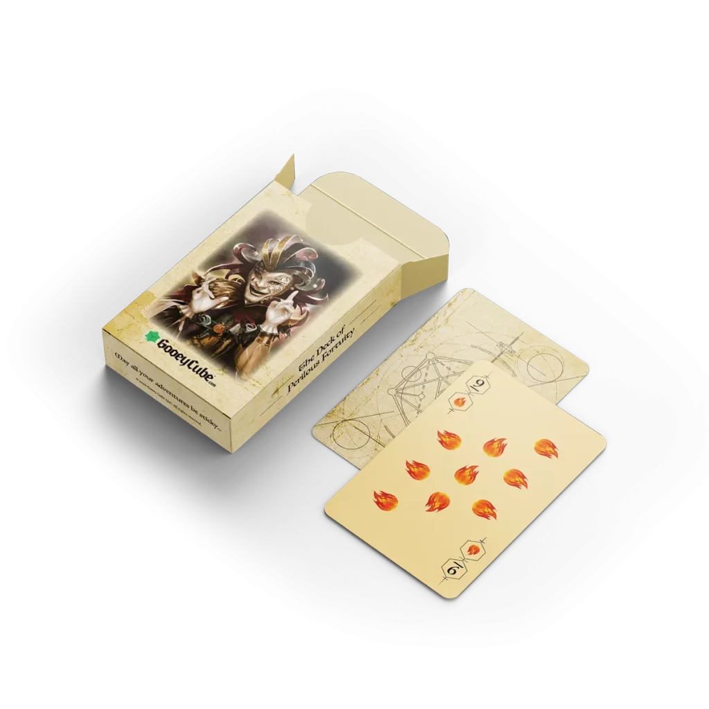
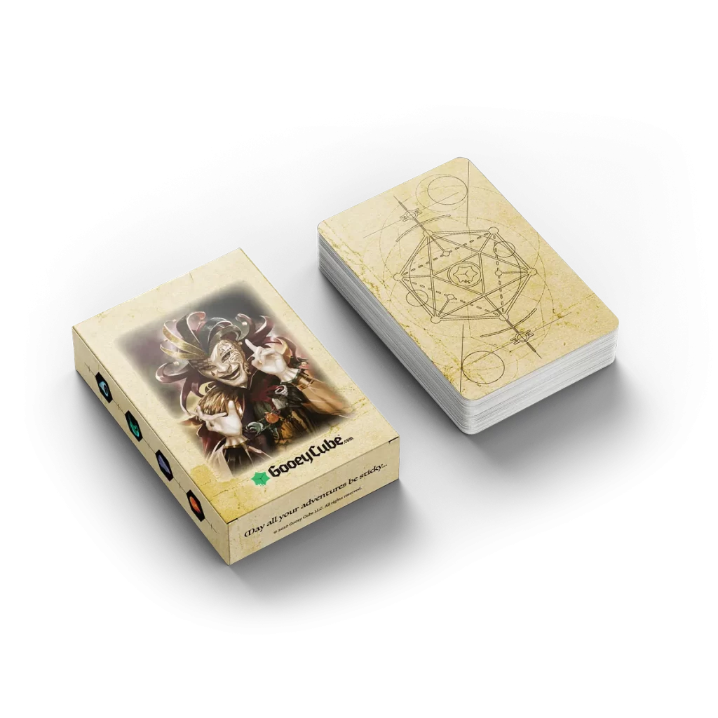
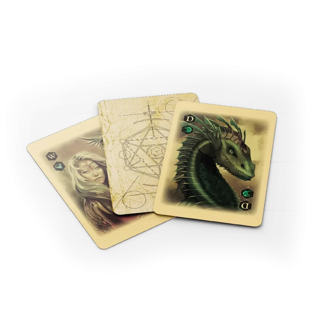
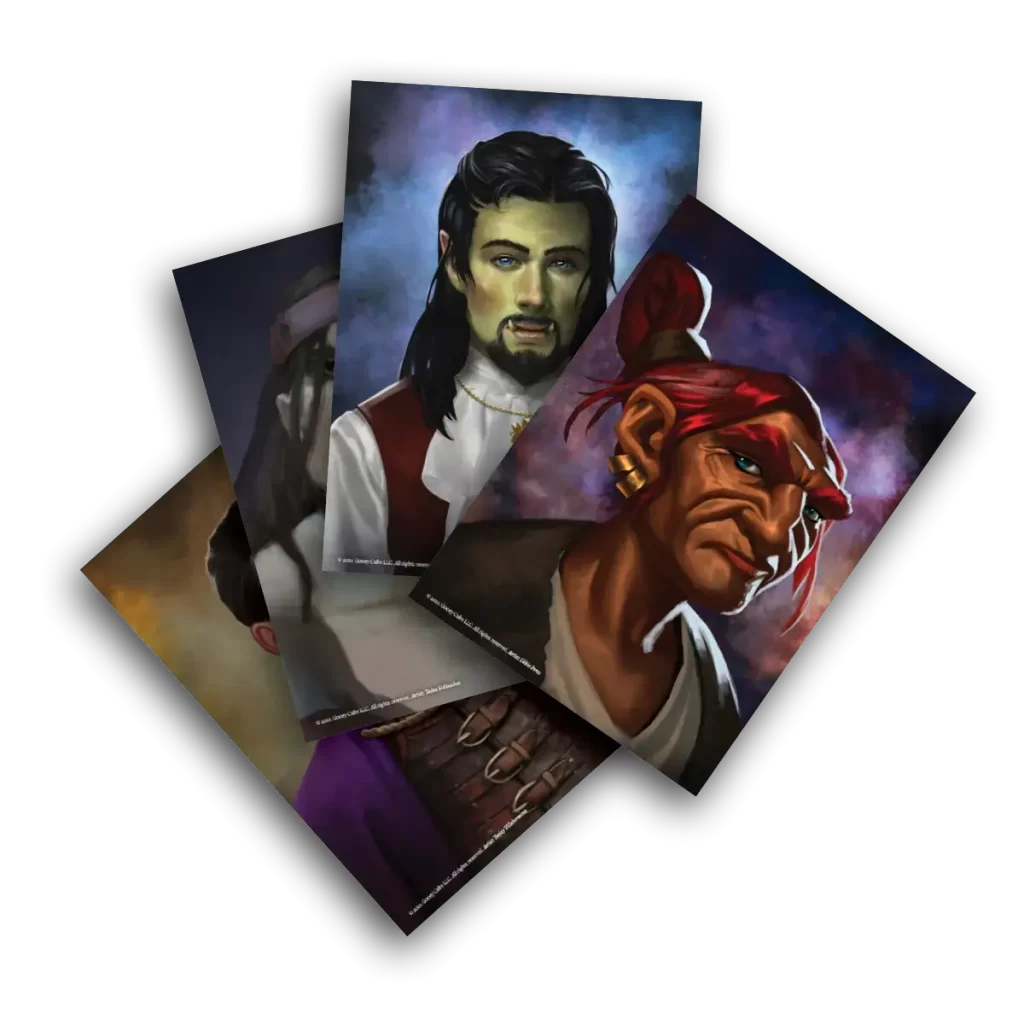
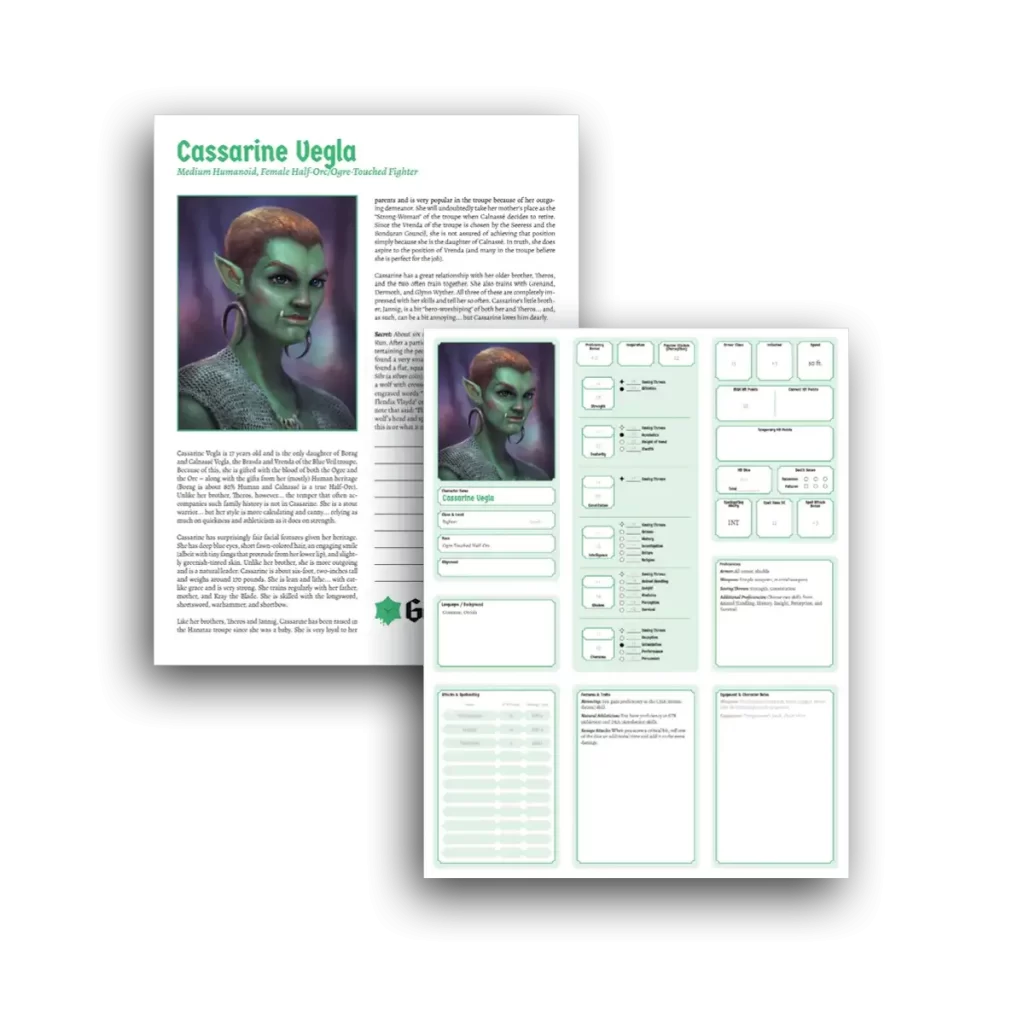
I led the design and art direction for various projects like playing card decks, adventures, tabletop experiences, merchandise, and our online store
Clients
Gooey Cube
Date
2023
Role
Senior Art Director /
Visual + UX Designer
Team
Creative Director
Kim Shugart
Senior Developer
Riley Pearce
Project Manager
Cody Martin
DELIVERABLES
Product Images
UI Design
Iconography
Typography
Website
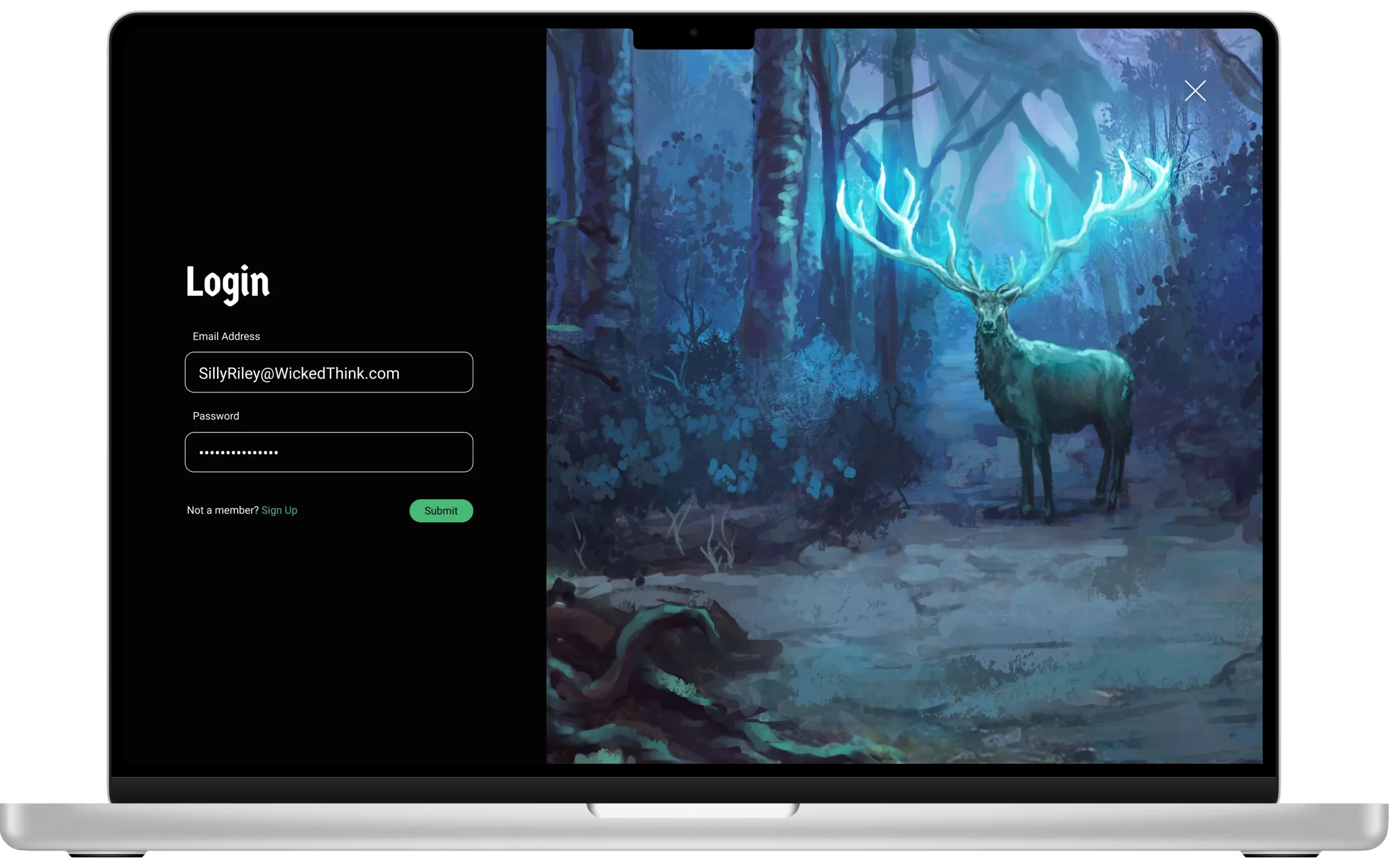
Initial launch Stats
From its initial launch in 2019, Gooey Cube’s first website was created to help sell products, and to give a place for fans to gather, and to inform customers about the World of Gooey Cube.
Sales: $14,000 in sales from 2019 – 2021
Returning Customers: 7 out of 10 would return to buy new products
Rebuild Stats
From its rebuild launch in 2022, Gooey Cube’s website was redesigned to better help sell products, and to give a place for fans to gather, and to inform customers about the World of Gooey Cube.
Sales: $58,000 in sales from 2022 – 2023
Returning Customers: 8 out of 10 would return to buy new products
Here's How We Did it
Project Vision
Overall, our goal was to present Gooey Cubes products as vital tools for game masters to use to enhance their tabletop role-playing games and to do that as clearly as possible while streamlining an online shopping experience.
The first step was to eliminate the barrier to entry with how complex the products are and to create a cohesive experience from what customers see from the website, to when they get a game from Gooey Cube in their hands.
Challenges
Clarity to the product’s values: Eliminate the barrier to entry by providing context and explanation of what value Gooey Cube offers its customers, and to provide context as to what the adventures have to offer
Establishing simplicity in the interface: Create a minimalistic UI while keeping fluidity as the focus, while designing a cohesive interface for familiar and unfamiliar users to feel comfortable interacting with
Converting customers, to community members: Provide a way for customers to engage with the company and its products to create longevity with their lifetime value
My Process
Research & discover
Define & Synthesize
Ideate & Prototype // Rinse Repeat
Visual Design
Discover Phase
Starting Point
When tackling this large project, we had decided to create the website in 2 phases.
Phase 1: establish an effective online storefront that displays our products in a clear way for costumers to understand the value of what they are purchasing
Phase 2: Establish a simple way to explain their complex products so customers would not only understand it but to show them that our products help to improve their skills in running a tabletop game
Phase 3: Create a clear path for interested customers to interact with Gooey Cubes community, to help cement their lifetime value as returning customers.
The team decided to create the website’s storefront first because that was the most dire area that needed to be addressed. Customers often complained that the site was slow and frustrating to use, and the company can’t make money unless it can sell products.
Communication, collaboration, and iteration were the three main ingredients when creating our design solutions for the website.
ASSUMPTIONS
Business Goals: How the business strives to succeed in the market
Users: Who is our audience? (Behavioral Archetypes, personas, etc.)
User Goals: What goals will the users want to accomplish when using the site?
Potential Features: How to bridge the gap between users and their goals?
User Testing
Our team interview a sample of ten participants when conducting research during our first design sprint cycle.
Trusted organizations
It’s easy to see that there are tons of online hobby stores that offer similar products, and 70% of participants we interviewed agreed that they preferred to use well known websites for most of their table top gear.
“I like to shop at wizards of the coast most often, but i usually will look elsewhere if a friend recommends a resource to me” – Becca
A Deeper Understanding
In our intereviews with users, we found that 75% of participants also like to play video games. They noted they had preffered shopping and buying most of their video games online, and preffered the experience that the playstation store and epic games provided.
“I wish that there was a streamlined way to get resources for my D&D games like i buy video games” – Eric
Competitive Analysis
We looked at several potential competing companies, and although not too many compete directly with Gooey Cube, they still infringe on the business’ revenue & popularity. Gooey Cube is a company that has the opportunity to capitalize on this by bringing services to create a one-stop shop for its customers.
The majority of the features between competitors were very similar, however the main differences that we noticed were:
– Easily Accessible vs. Hardly Accessible
– Too Many Pages vs. Simplified Interaction
– Bright / Distracting Interface vs. Minimalistic Interface



Define & Synthesize
Primary
Eric // Age: 24 // Denver Colorado // Bar Tender
Eric is a 24-year-old college student, raised in Denver, and works a part-time job on top of his full-time classes. Eric’s goal is to graduate with his bachelor’s in communication, and he just got a job as a bartender at a local cocktail bar. He has had the same group of friends for the last five years playing games together. He loves playing D&D and wants to improve his overall story-telling and game-master skills.
SECONDARY
Alex // Age 58 // New York // Bachelors degree // Lockheed Martin
Alex, a seasoned 58-year-old software developer, has been an avid D&D player for decades. Despite his vast experience as a player, he’s never taken on the role of a Dungeon Master. Fueled by curiosity and enthusiasm to lead his own game among friends, he’s eager to embark on this new journey but feels lost on where to start and what essentials he requires.”
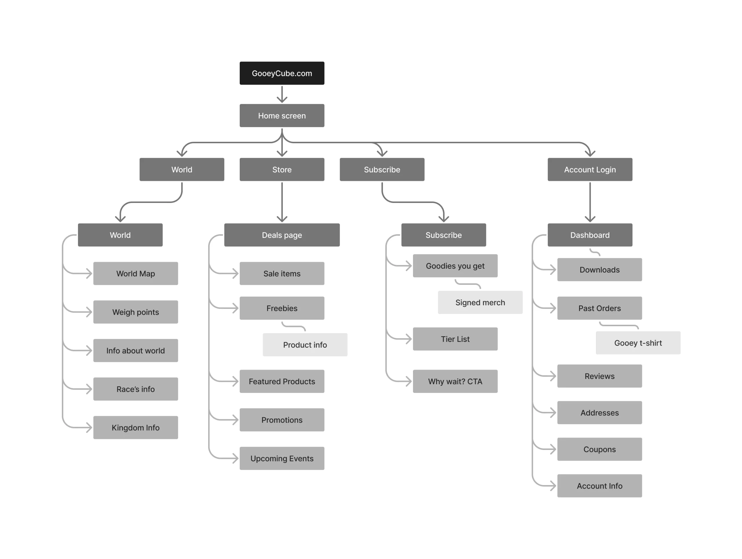
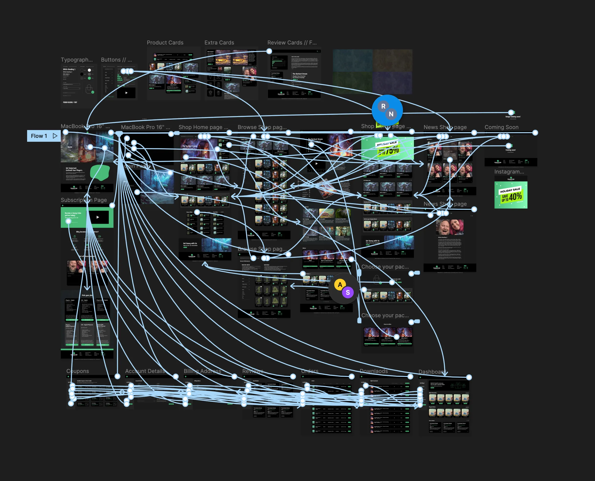
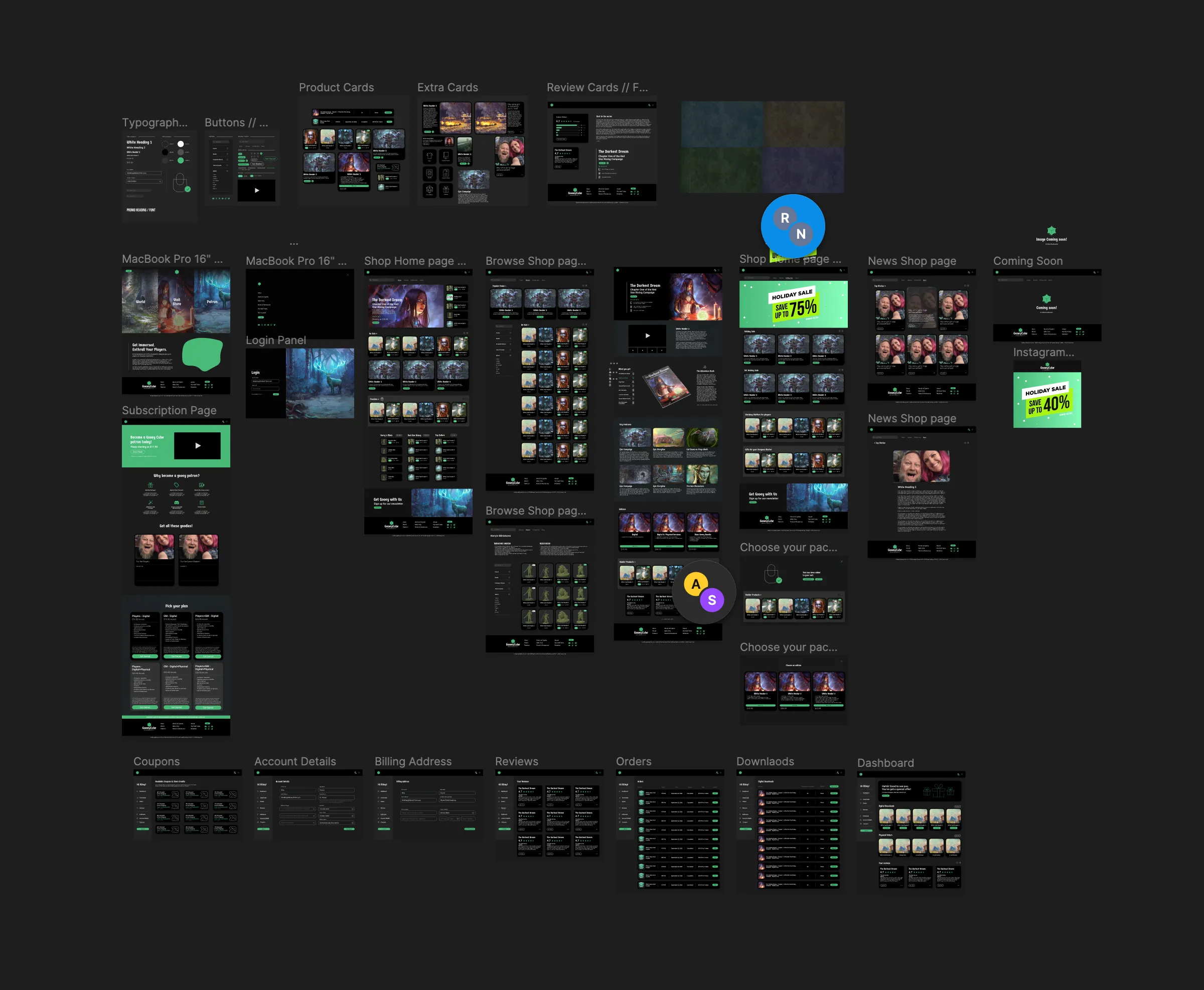
We mapped out the entire user journey from start to finish for purchasing an item. This exercise gave us valuable insights into how users engage with the website and allowed us to visualize their navigation based on their goals. Leveraging our previously gathered user insights, we tailored specific user flows for each persona. Additionally, we created a sitemap to visually represent the app’s navigation structure. This helped us determine which key screens needed design attention in the upcoming phase.
Ideate & Create
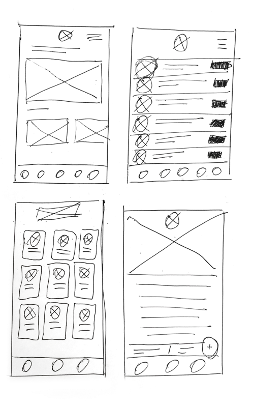
Paper Wireframes, prototype, test, and repeat
We started by sketching out initial ideas on paper to swiftly generate and iterate concepts. These sketches were then transformed into a basic digital prototype for low-fidelity testing, revealing minor issues and areas of friction. Insights from these tests guided us in refining both the user interface design and its overall structure. We engaged in discussions about the strengths, weaknesses, and potential variations of each sketch. Witnessing the evolution of these rough concepts was fascinating—it marked our first opportunity to visualize diverse interpretations and iterations of the website’s intended look and feel.
Visual Design
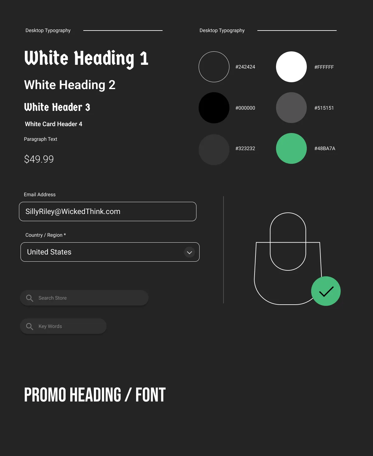
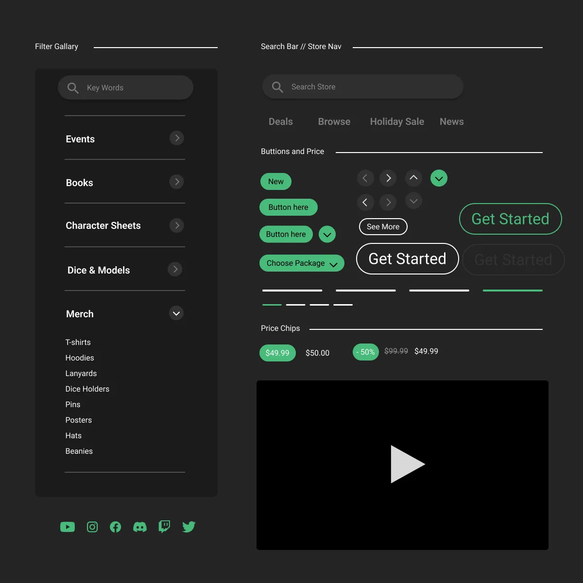
Style Guide
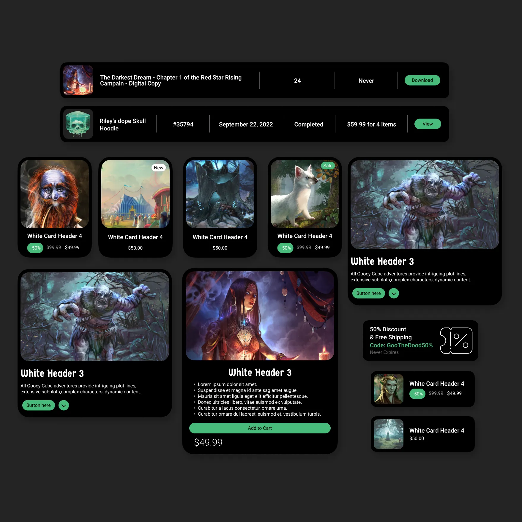
We leaned heavily on calming dark grays with the gooey green calls to action to create this signature look. We aimed for a straightforward experience. We wanted Gooey Cube to have a premium experience not just on the website — but to reflect the quality of the products they offer. It doesn’t have to be complex or frustrating. The home screen feels warm and welcoming enough to draw the user further in. While also displaying the most relevant information firsthand.
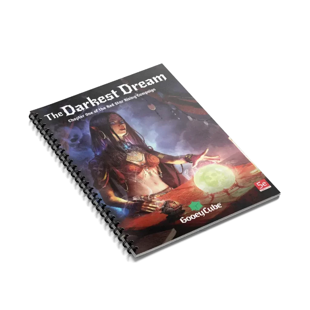
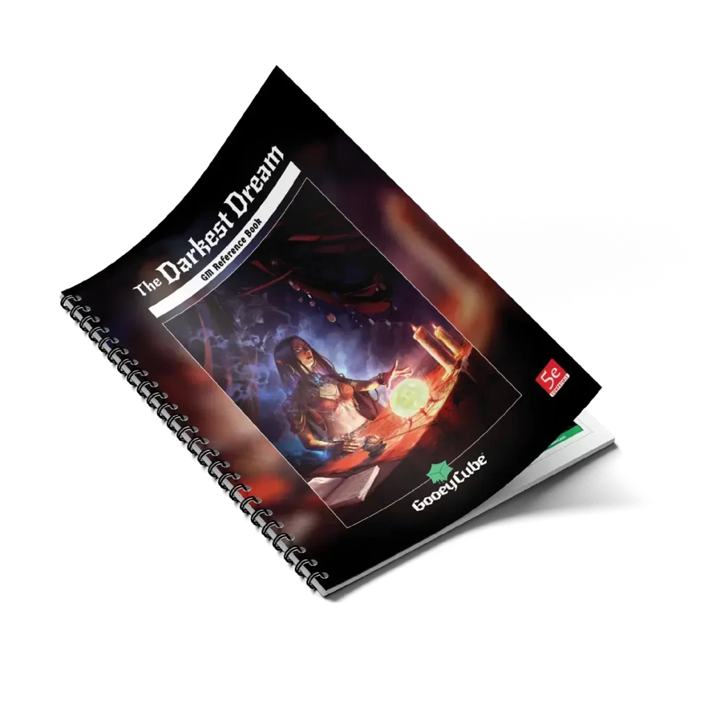
Product Images

Wireflow
After sketching out some paper wireframes and thinking through the preliminary flow, we reviewed what was most needed, and unnecessary. We poured a lot of our time into this step to make sure we had the finishing touches on the underlying UX before moving on to the visuals.
Further User Testing
After running user flow tests within and outside our Gooey Cube community, it was clear that customers appreciated the website’s UI and dark theme. However, we noticed a common hurdle: folks weren’t sure where to dive in. Questions like ‘Which adventure suits newcomers?’ and ‘How do I differentiate between lore books and adventure boxes?’ popped up frequently.
Moreover, customers seemed to struggle with product searches, likely because they weren’t sure where to start or what exactly they were looking for initially. Also due to the filter functionality showing a lot of “suggested” or “similar” products, vs what customers wanted to see.
Customers also noted they were expecting a different sitemap to the site when you first landed. In its current state, it does not use a traditional main navigation. There wasn’t an “about” page or “FAQ” page for users to refer to, which some found confusing.
Findings & Solutions
Bring Context for Newcomers: How the business strives to succeed in the market
Simplify Search and Filtering: Instead of using a filtering system for the whole catalog of Gooey Cubes products, create individual pages for each product category, and place that into the main navigation to help simplify the delineation of products.
Introduce Familiarity: The aim is to create a sense of comfort and ease for users, as they’re likely to navigate more effortlessly on a platform that feels familiar to them. Design elements of a website or interface in a way that’s similar to what users are already accustomed to
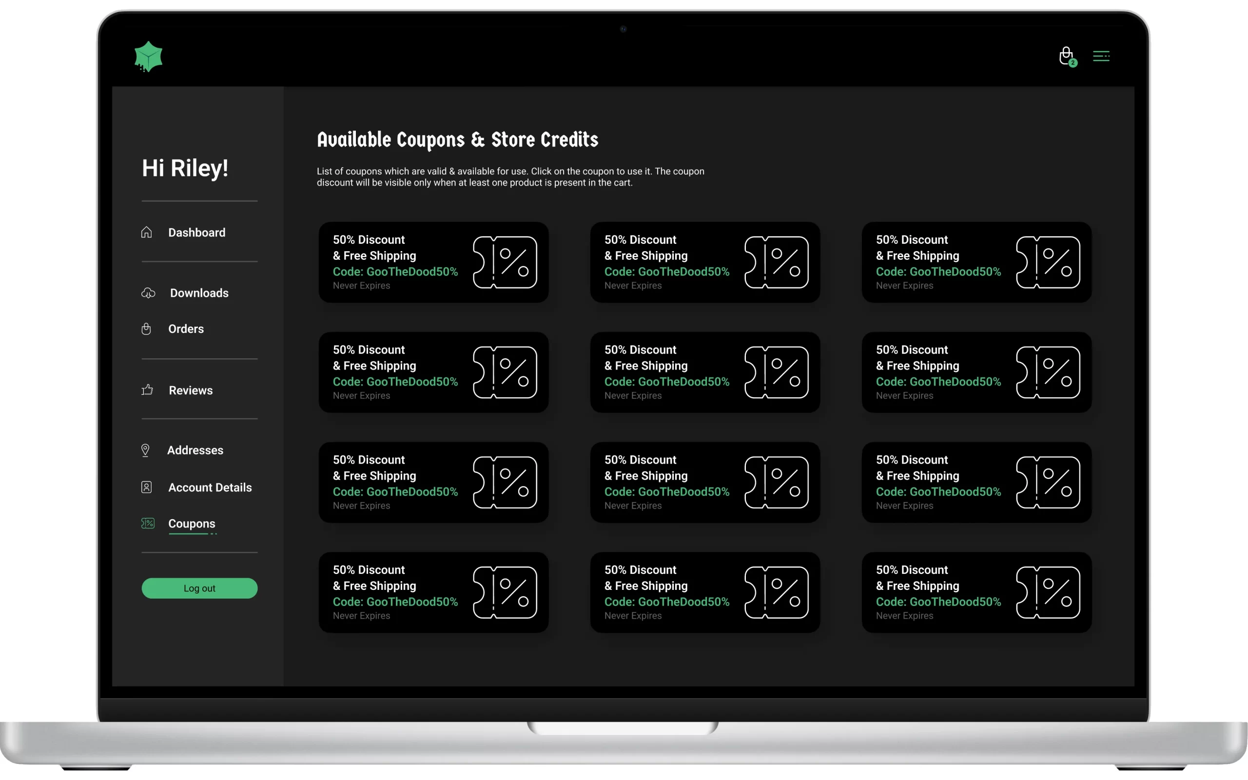
Establish a Path for Community Members: Create better stickiness to the site by providing information and resources for community members
Final Design
Establishing Context
Tabletop role-playing games (TTRPGs) can be pretty complex, especially when you’re creating your own game and world. The challenge? Getting potential players and game masters excited about what you’re offering.
Sure, we’ve got a slick website, but just having a nice storefront isn’t enough. We realized that to get people interested, we needed to show them why they’d love our games.
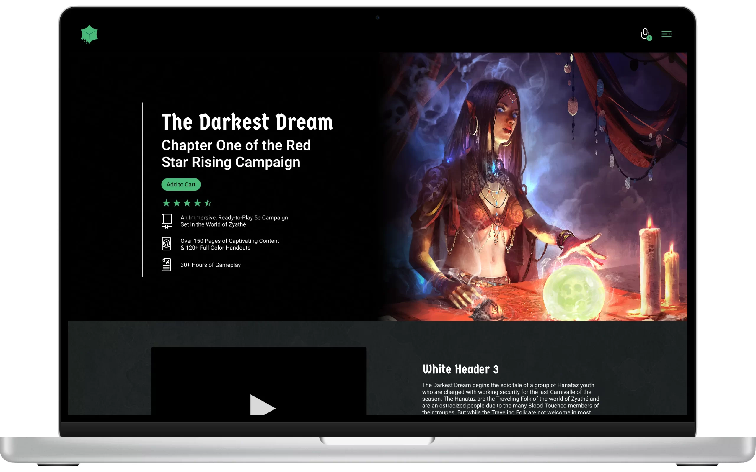
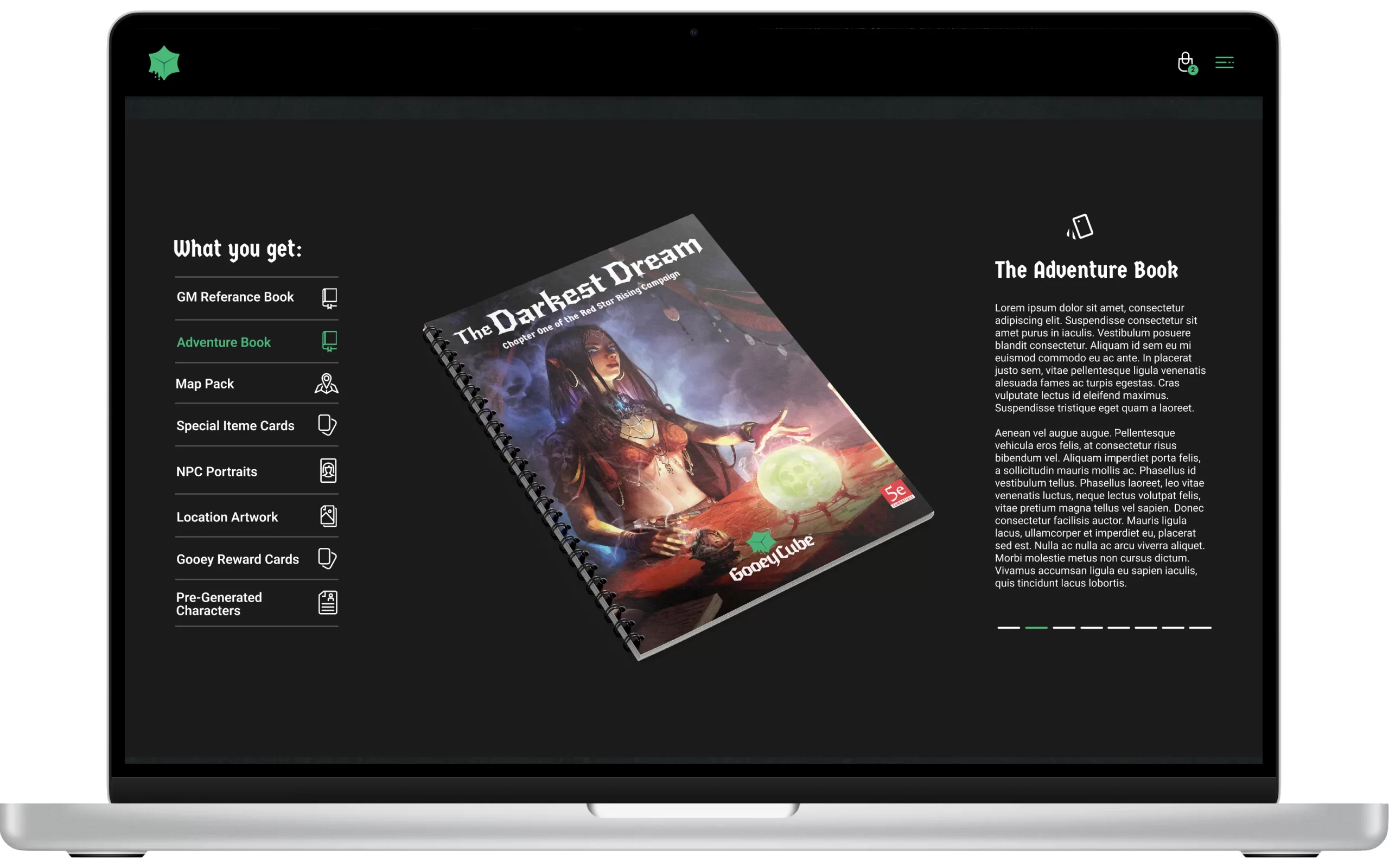
So, we revamped our homepage to be a kind of welcome mat. It’s the first thing visitors see, and it walks them through our top products and, most importantly, how our games make it easy to create awesome adventures for your tabletop sessions. We wanted to make it crystal clear why our games are worth checking out, so everyone—from beginners to pros—could understand and get pumped about the experiences our games bring.
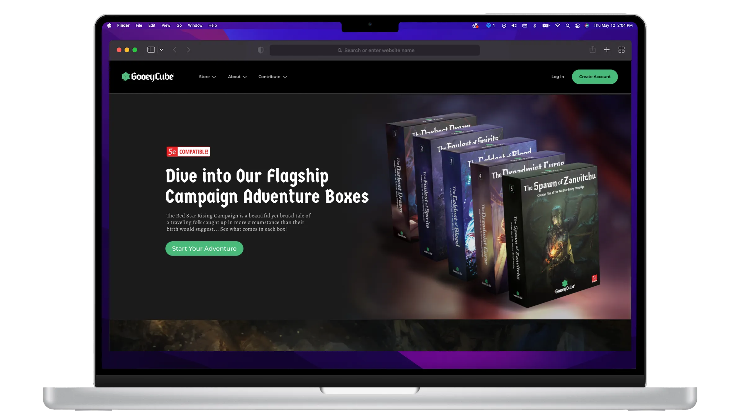
Introduction page
We made a big change on our homepage by putting our products front and center. Now, when you land on our site, you’ll see exactly what’s in each adventure box and all the cool stuff we offer game masters. This switch has really boosted sales and gotten both new and old customers more engaged with what we offer.
Plus, we revamped how fans connect with us. Creating a space for our fans to chat with us and each other hasn’t just made our website more interesting—it’s made Gooey Cube a more memorable brand overall.

Menu Organization
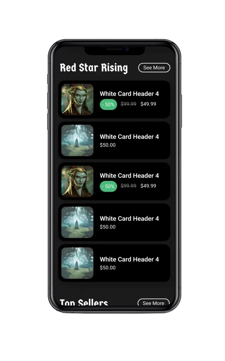
We also categorized all of our products within this menu under the main navigation, so if a customer was looking for something specific, like The Red Star Rising Campaign, then they can easily and quickly see the results they want.
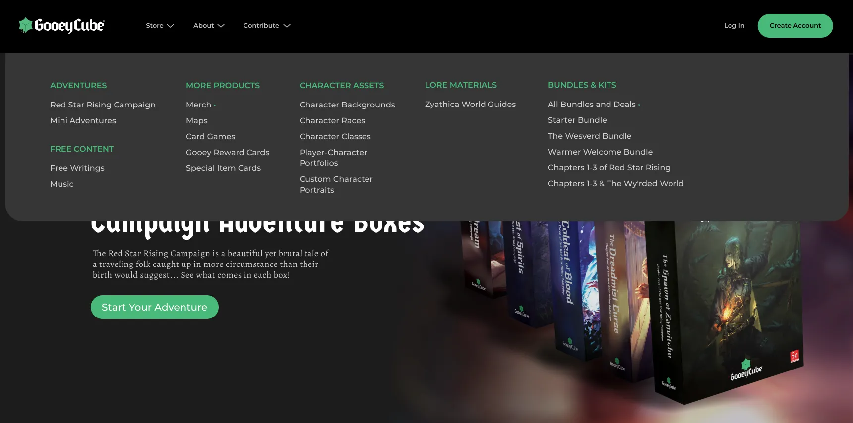
Challenge 1
Eliminating Barriers
A key factor when trying to gain a user base is to create a home screen void of conflict. If the user wishes to browse the pages, they might be more inclined to browse the selection of featured products on the home page before advancing further into the site.
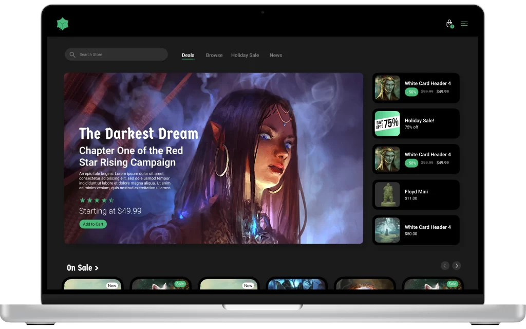
Challenge 2
Staying Focused
The UI consists of a neutral, calming dark gray with gooey green calls to action to create signifiers and highlights. Using color sparingly throughout the application’s interface allows for the items to be the focal point during user engagement.
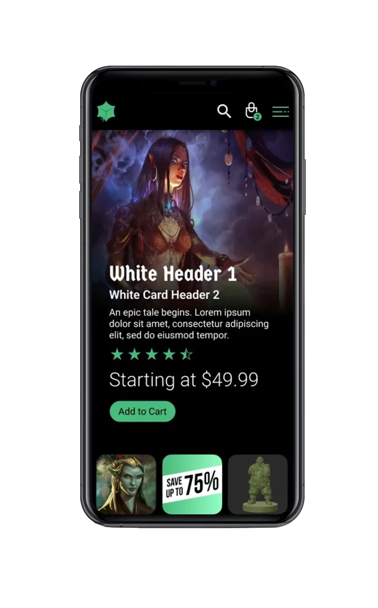
Challenge 3
A Familiar Experience
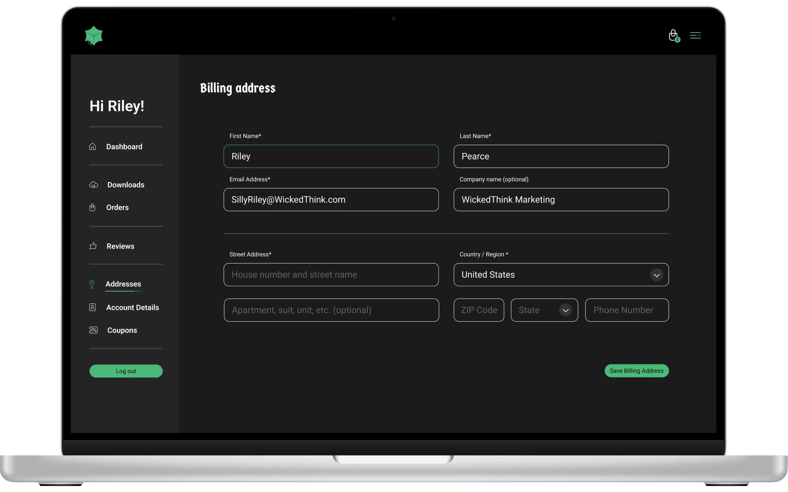
While Gooey Cube’s primary audience is 25-55-year-olds with some experience with role-playing games, we wanted the site to be approachable to those outside that world. With recognizable iconography, artwork, an intuitive layout, and a simple linear purchasing process.
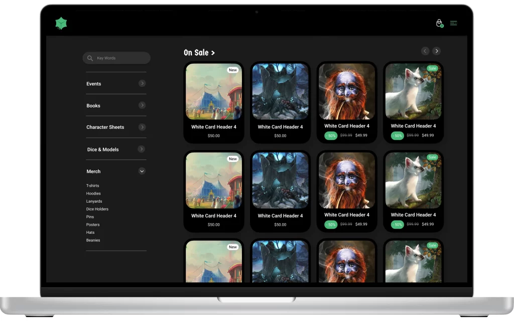
Challenge 4
Simple, & intuitive
With a purchasing method being accessible within one or two taps or clicks on any page, it allows the user to easily access any product or products information within a few taps. This design allows for minimal screen usage while finding needed information.
To Recap...
Initial launch Stats
From its initial launch in 2019, Gooey Cube’s first website was created to help sell products, and to give a place for fans to gather, and to inform customers about the World of Gooey Cube.
Sales: $14,000 in sales from 2019 – 2021
Returning Customers: 7 out of 10 would return to buy new products
Rebuild Stats
From its rebuild launch in 2022, Gooey Cube’s website was redesigned to better help sell products, and to give a place for fans to gather, and to inform customers about the World of Gooey Cube.
Sales: $58,000 in sales from 2022 – 2023
Returning Customers: 8 out of 10 would return to buy new products

