Vantage Homes
User Experience & VISUAL DESIGN
From the day Vantage Homes started in 1983, their commitment to customers and the industry became not only building higher quality houses, but also creating a uniquely enjoyable experience of all joining together to make a Vantage home.
Ethically grounded in proven building tradition, yet also involved in all the most modern and innovative construction methodologies.
Clients
Vantage Homes
Date
2018 – 2022
Role
Art Director / Visual + UX Designer
DELIVERABLES
Creative Direction
Band Assets
Website Layout
UI & Styleguide
Digital Assets
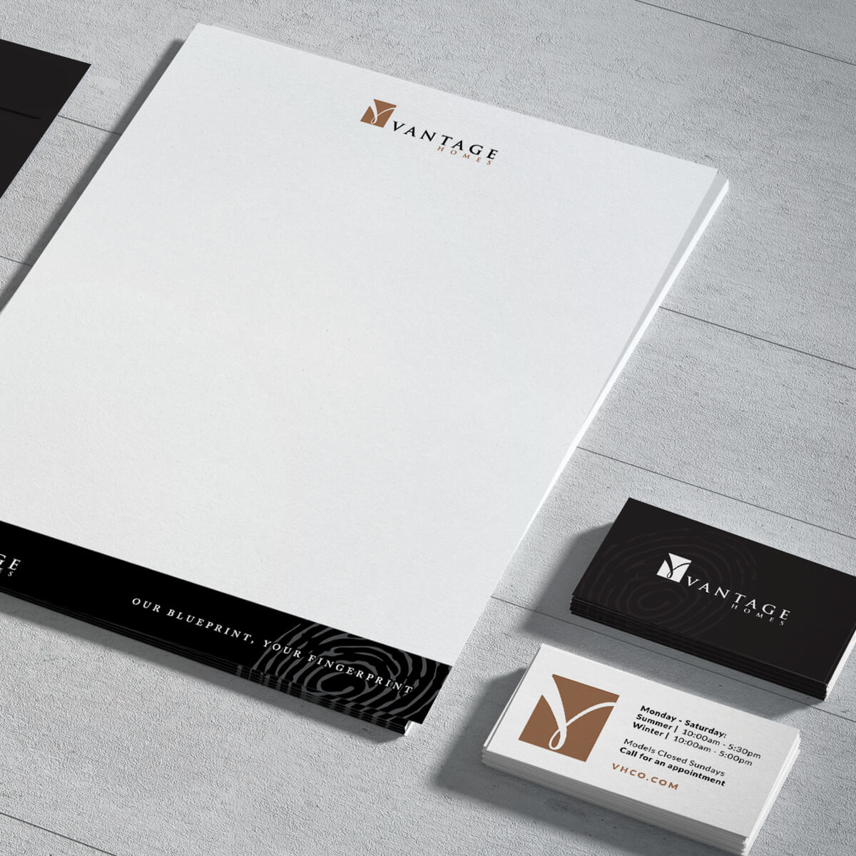
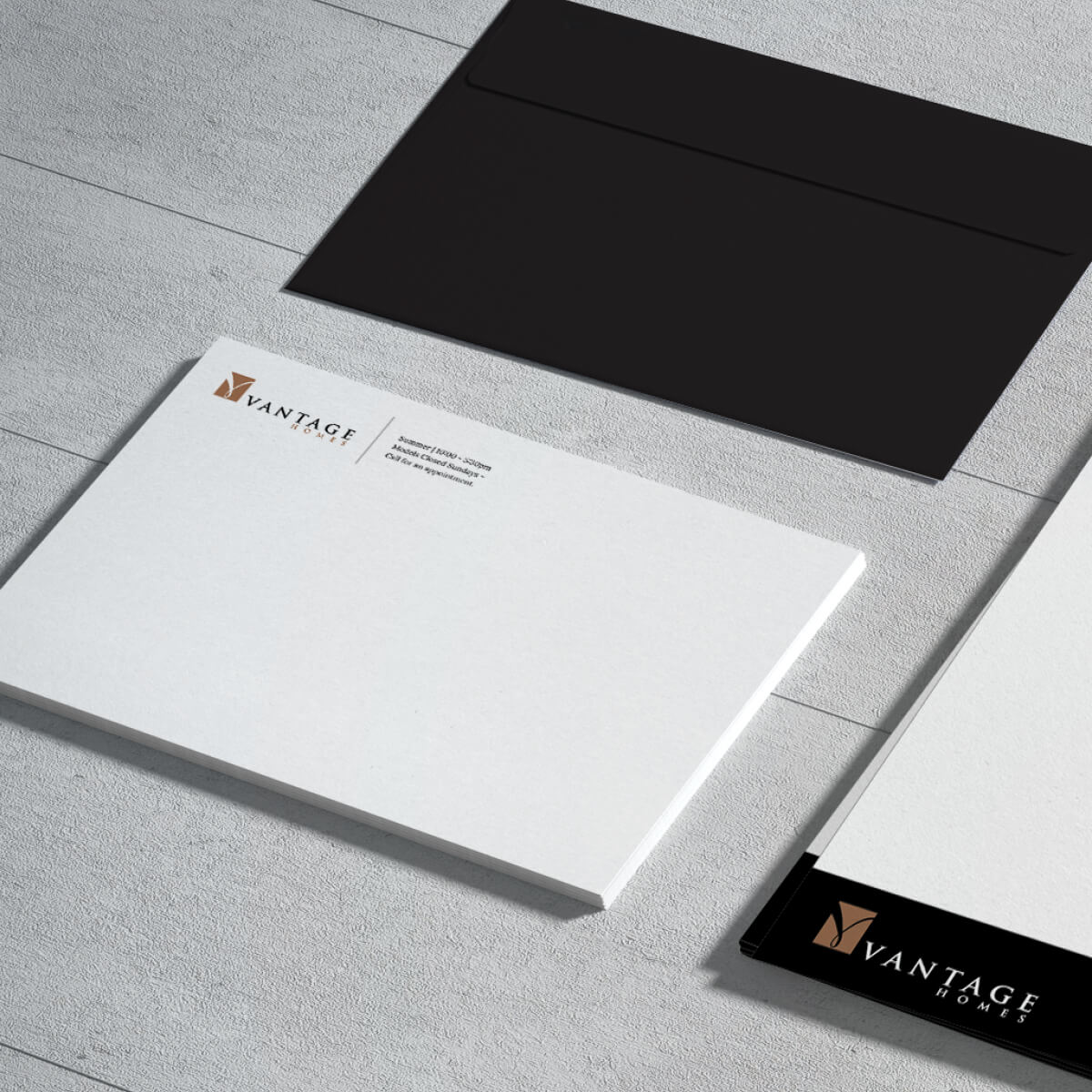
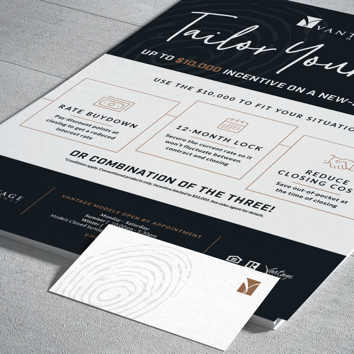
Stationary
Website
Starting Point
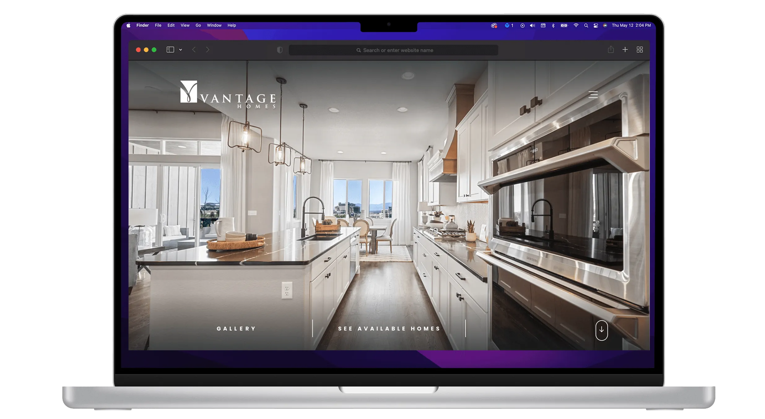
In this ambitious redesign project, we embraced a holistic approach that honored Vantage Homes’ heritage while embracing its modernity. Our journey was guided by in-depth qualitative research, drawing inspiration from the rich tapestry of Vantage Homes’ history and values, all while simplifying the process for customers to research and discover their dream home at Vantage.
The website required meticulous design to offer relevant and clear information to individuals in the market to purchase a home, in a region teeming with multiple home builders. Our goal was to set Vantage apart from the competition by modernizing its style and streamlining potential customer journeys, ultimately leading them to contact a sales agent.
Challenges
- Embodying Tradition and Innovation: We needed to create a website that seamlessly weaved Vantage Homes’ traditional values with its cutting-edge construction methodologies.
- Cohesive Brand Representation: The challenge was to ensure that the website represented the Vantage Homes brand cohesively, from the deep-rooted traditions to the most modern innovations.
- Intuitive User Experience: The website had to provide an intuitive user experience, guiding visitors through Vantage Homes’ offerings and services while reflecting their dedication to excellence.
- Bridge the Gap Between Legacy and Future: We needed to bridge the gap between Vantage Homes’ storied history and its forward-looking vision.
User Testing
We understood that Vantage Homes’ audience consisted of individuals seeking a dream home in a competitive market. From those who appreciated traditional craftsmanship to those interested in the latest construction technologies, we conducted interviews and usability testing to comprehend the unique needs and expectations of these diverse users.
Organizational Tools
Our design process was guided by a deep understanding of Vantage Homes’ business objectives, their varied clientele, and the features that would best serve their audience’s aspirations.
Creating a Framework
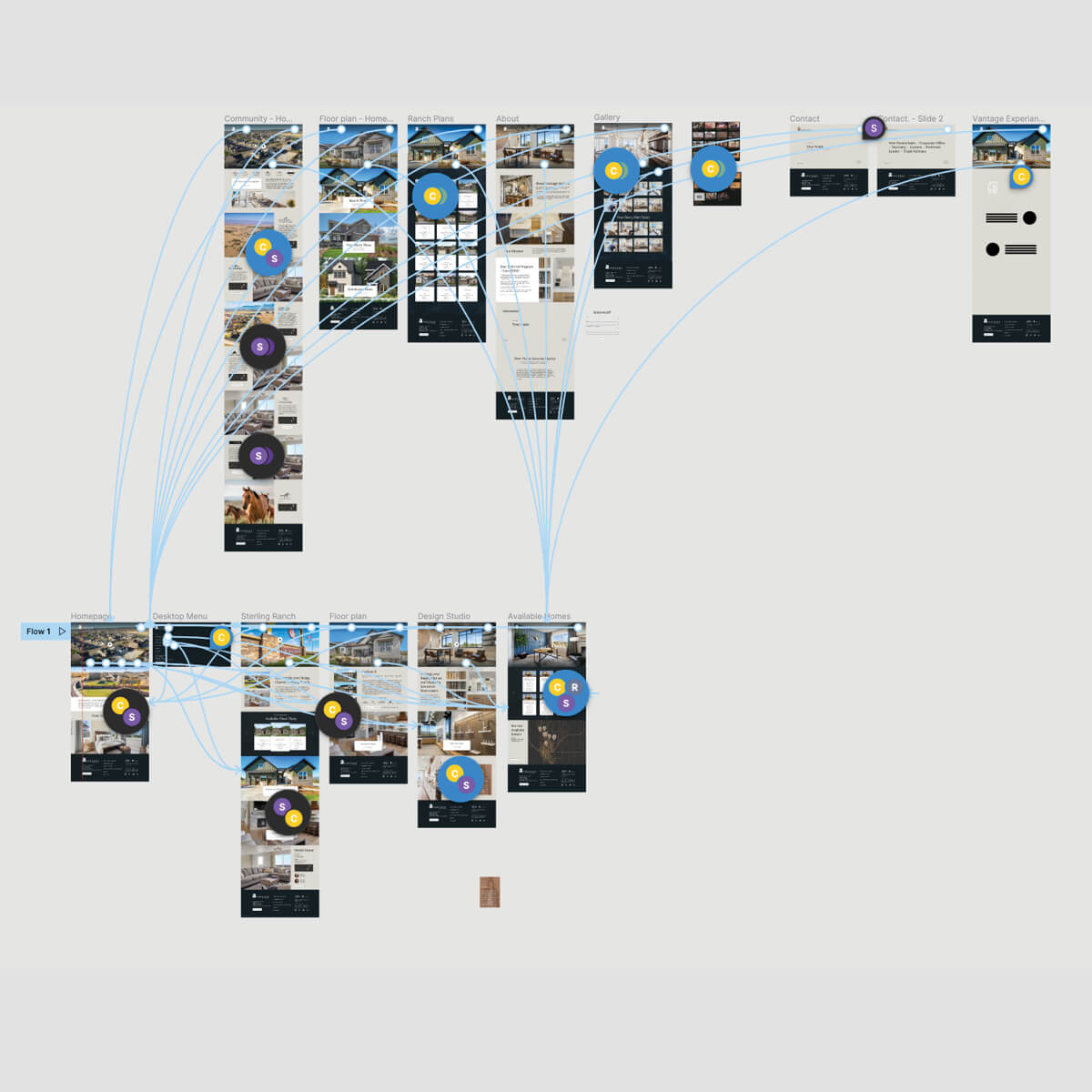
We began our quest by creating a comprehensive user flow that mapped the entire journey of a potential home buyer. From initial exploration to the critical decision-making process, this framework allowed us to design a user-centric experience that mirrored Vantage Homes’ commitment to customer satisfaction.
Wireflow
The digital wireflow was the bridge between tradition and innovation. We meticulously considered what elements were necessary, which were extraneous, and where enhancements were required. This phase ensured our design would encompass timeless quality while embracing modernity.
Challenges and Solutions
Merging Tradition and Modernity
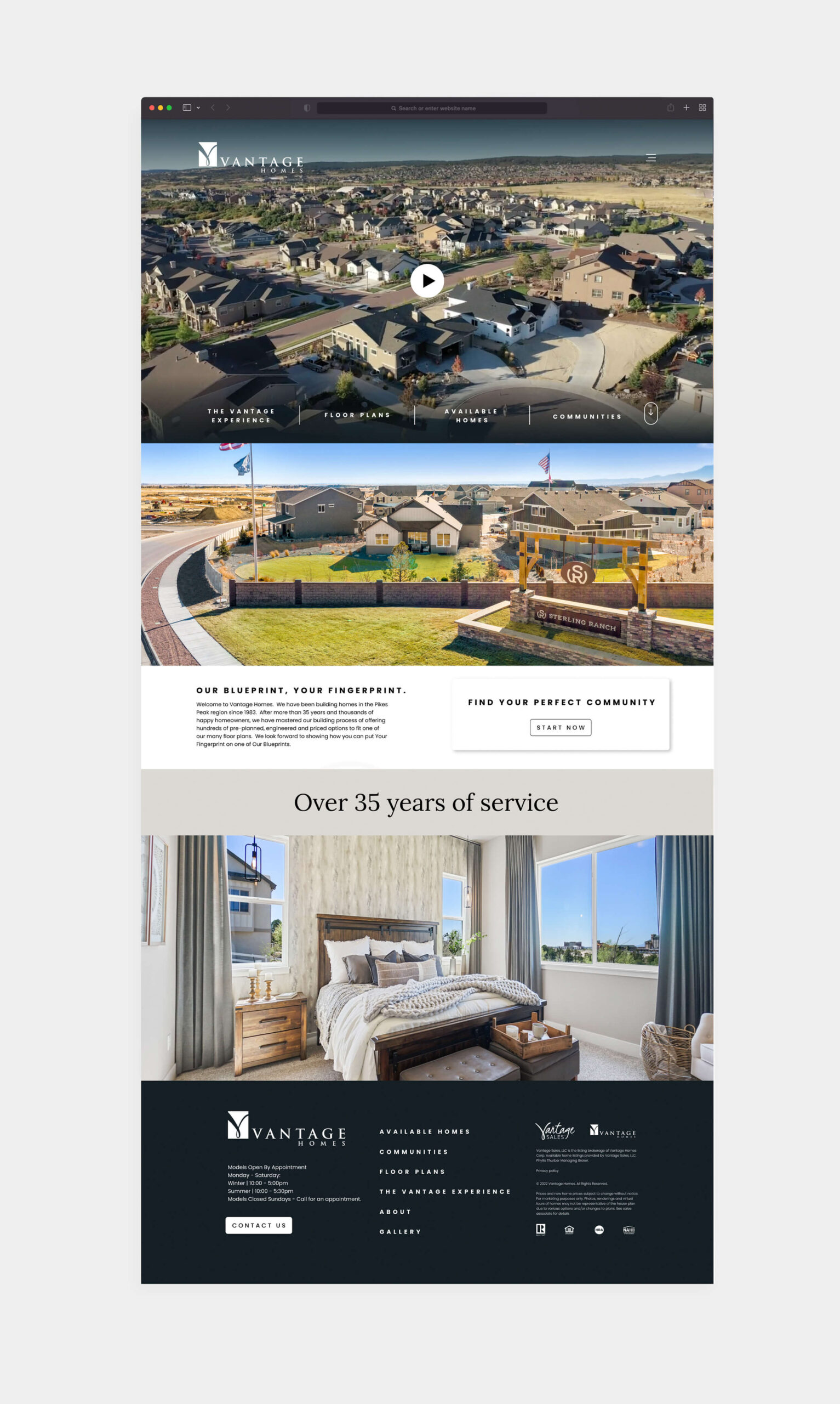
To honor Vantage Homes’ legacy while embracing their forward-thinking approach, our design merged elements of tradition with modernity. Traditional motifs intertwined with modern design elements to create a harmonious user experience.
A Unified Brand Representation
We sought to reflect Vantage Homes’ brand cohesively by infusing the website with their core values. From the color palette to the imagery, every aspect was carefully curated to embody their commitment to quality and innovation.
Intuitive User Experience
The website was designed to be user-centric, ensuring that visitors could navigate through Vantage Homes’ offerings with clarity and ease. Information was presented in an organized and visually appealing manner, simplifying the customer’s research journey.
Standing Out in a Competitive Market
In a crowded market, the website became a powerful tool for Vantage Homes to stand out. Its modernized style and streamlined customer journey directed users towards contacting a sales agent, making Vantage Homes the natural choice.
Style Guide
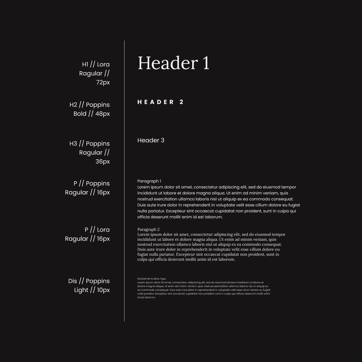
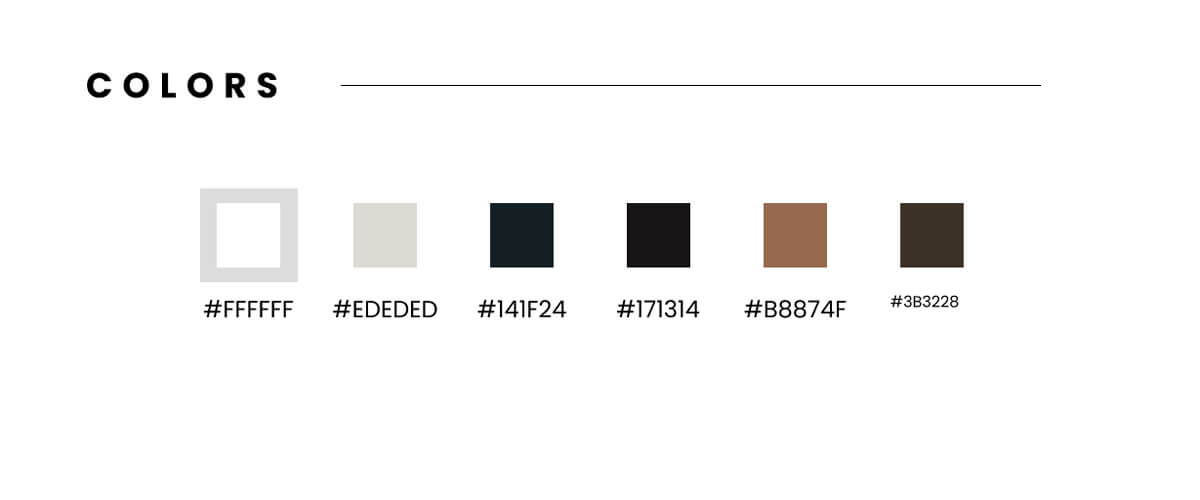
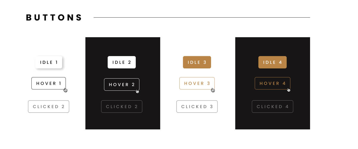
Our style guide was a testament to Vantage Homes’ values. We selected a timeless color palette that symbolized tradition and innovation. Classic design elements were fused with modern, sleek touches, creating a website design that resonated with visitors. It echoed the warmth of Vantage Homes’ craftsmanship and the promise of a brighter, smarter future.
The Vantage Homes website redesign serves as a digital testament to the company’s unwavering commitment to excellence, merging tradition with innovation. It provides a captivating and informative experience for all those on a quest to find their dream home, simplifying their journey to reach out to a Vantage Homes sales agent.
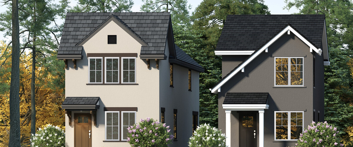
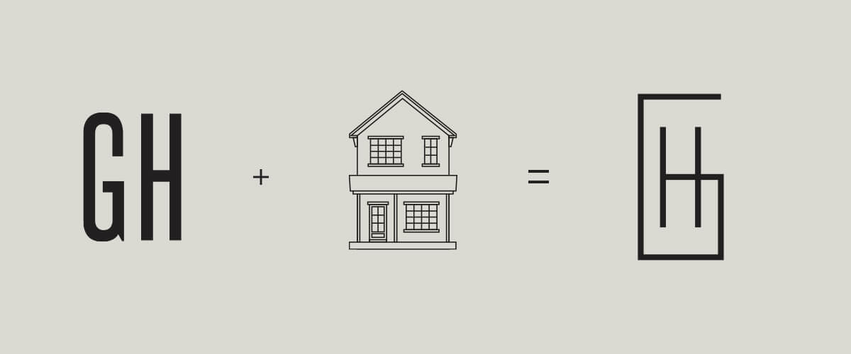
The Gatehouses
As an established business, Vantage sought out a brand identity for one of their new, smaller homes. To establish and differentiate themselves in its look, lifestyle and feel. They wanted to create a premium home for new home buyers, or those looking to downsize. Welcome to the Gatehouses.
